You've decided to place a cryptocurrency related banner ad? Smart move! Affordable, measurable and effective, banner ads have rightfully claimed their place as the workhorse of today's marketing world.
Within the narrower sphere of crypto media, it's specifically the in-page banner that's king. This is far and away the most requested format among our clients and – no surprises here – the one that most chalks up the most impressions. Our in-page banners come in six sizes, with 300 x 250 (medium rectangle), 728 x 90 (leaderboard) and 160 x 600 (wide skyscraper) being the most demanded ones.
Once you've settled on your size, the next step is to come up with a catchy design, one that grabs viewers' attention, flatters your brand and drives those all-important clicks!
If you're stuck for ideas, have a look at our list below. We've included some banner examples of the crypto industry players, along with explanations of why we like them, to help you get your creative juices flowing.
Bitcasino

There's a lot to be said for keeping things ultra-simple, and this Bitcasino ad certainly fits the bill with its no-nonsense approach. The background is basic and the text gets right to the point.
Experienced designers will also notice how the components are balanced using what those in the industry call “hierarchy.” The rules of hierarchy state that the company logo should be visually dominant (brand awareness is important, after all), but less dominant than the value proposition or the call to action.
The value proposition, i.e. your fantastic offer, should take up the most space and be the first place your eye lands. Finally, the call to action, the button that invites you to “start now” or “learn more,” should be the ad's focal point.
Ads don't always have to include an image, but in this case the bright graphic does a great job of catching the eye. It also conveys the instant, clear message that this offer is about bitcoin casino gaming.
The Abyss
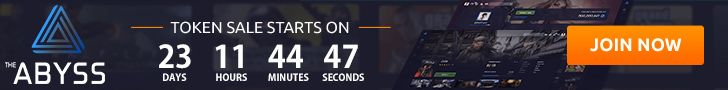
This ad's spacey imagery and “multiverse” slogan are definitely no cosmic accident.
The Abyss, a platform for MMO games, has put a lot of effort into building its brand identity around a sci-fi, dark universe theme, which you'll see plenty of on their homepage. This is a perfect example of consistency in design across multiple marketing channels, an important part of maintaining that valuable identity.
The takeaway here: if you've already got a design theme and approach for your other marketing material, whether it's for your whole brand or just this one campaign, make sure your banner ad matches.
Another reason we've included this ad is the countdown clock at the bottom. The way the clock is moving, ticking down those seconds, attracts attention on the page similar to the way an animation would. More than that, it's a perfect tool for instilling a sense of urgency in the reader. If they don't hurry, they'll miss an amazing opportunity and the universe as we know it will end.
HashFlare

What pops out at you first when you glance at this HashFlare ad? Right, the cool value proposition, and that's just as it should be. The design throws the spotlight on that critical line of text through the use of slightly contrasting background colors, a method that can be a good alternative, or complement, to simply using a larger font.
In this case, we're not particularly bothered by the absence of a call-to-action button, especially since the space is filled by such a brilliant graphic. There really couldn't be a more straightforward way to illustrate the joys of cryptocurrency cloud mining than clouds, mining picks and flying money!
Cryptospace

Here's a design that's a far cry from the rest of the pack. Notice there's no cartoon image, no bold offer and no explicit call to action. Instead, the ad for the Cryptospace conference has a slick, professional look with the kind of design elements one would expect to find in an investment brochure.
This is a good example of designing with a specific target audience in mind, in this case, serious people who have a professional interest in crypto. These particular web surfers will likely tune out the loud and colorful ads they're used to seeing, and instead zero-in on something that looks like it's for them.
The ad strikes just the right tone, providing information on the what, the when and the where. Including the headshot of the featured speaker with only his name is a clever way of implying that he's a hot item on the conference circuit, and if you don't know who he is, you probably should.
MonsterBit
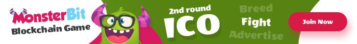
The MonsterBit example shows how using humor and being a little different can make your ad stand out from the crowd. Having cute monsters never hurts either.
Here the design follows the basic rule of hierarchy mentioned above for the logo and informational message, but gives it a twist with the slanted text lines. The right side is reserved for a CTA button. Like the design for The Abyss, the style and theme are consistent with the rest of the product, which in this case happens to include these goofy characters.
Now it's design time!
Hopefully these examples have given you some fresh ideas and provided just the spark of inspiration you need to get your cryptocurrency ad design rolling.
If you're still lost or don't have time to deal with ad design (because you're busy running a company), Cointraffic is here to help. Our experienced team of in-house designers can prepare HTML5 animated banners for your ad campaign. Just get in touch with us to find out more.
Good luck with your designing!